Responsive Design
"Responsive Design" is the strategy of making a site that "responds" to the browser and device that it is being shown on... by looking awesome no matter what.
You can also check out this visual explanation: http://johnpolacek.github.io/scrolldeck.js/decks/responsive/
Examples of responsive sites:
Non-responsive sites
You'll be hard-pressed to find a major website that doesn't deal with mobile devices somehow. Reddit isn't specifically responsive, but you do have the option of switching to a mobile-optimized site.
If you look at the Reddit site on your phone, try selecting "mobile site" from the site map at the bottom of the page. How does this change your experience?
The Web has always been responsive
From the beginning, the web has been meant to be shown on a variety of different screens.
Text wraps
Floats automatically position themselves based
on screen size
percentage sizing
If we go to this simple example, we see that floats reflow, depending on screen width. Likewise, the paragraphs remain at 50% of screen width, no matter what this screen width is.
See the Pen Float demo by Brian Hague (@bhague1281) on CodePen.
Basic CSS only gets us so far and can seriously restrict how we structure the layout of the page.
Making Responsive Webpages
The Viewport
When web developers started creating sites for mobile, they had problems with displaying pages that were initially created for desktops. They were too large! The quick fix was to scale pages to fit the screen, but we ended up getting results like this:

Yikes, that's hard to read on a small device. The solution is that we need to control the width and the zoom level of the page.
When creating sites for mobile (which you should almost always do), we want to control the page width and zoom level of the browser using the viewport tag:
Doing so will give us something like this:
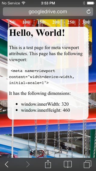
Much better! Pictures courtesy of Google Developers
Media Queries
Media queries are simply a way to conditionally apply styles based on the device the page is being displayed on.
We already know that if we do something like this:
By default, all p tags will have red text, unless they have the class blue_text, in which case, the text will be blue. We can do a similar thing with media queries.
Now, all p tags will be red, until the screen size reaches 600px, when they'll turn blue. While this isn't super useful, it does demonstrate how we can apply styles conditionally when we meet certain device measurements.
Anatomy of a Media Query
The syntax is quite a bit different than normal CSS so let's examine what we see here:
Media queries always begin with @media. The second option you see there is the word screen. This tells the browser that we are interested in screen measurements. There are two others we could use instead of screen: print is used to apply styles when the document is being printed, and speech is used to apply styles for screen readers. We'll mostly be using screen. You then need the word and to connect the the first test (whether we are on a screen) to the second test (whether the screen has a minimum width of 600px.) That last test is always in parentheses and always takes the form of a CSS property-value pair.
You can chain multiple tests onto your media query. For example, you wanted to apply styles between a min-width of 600px and a max-width of 900px, your code would look like this:
There are many, many bits of information about the environment that we can query. You can see a full list here. However, for the most part, we will only be querying min-width and max-width from the screen.
A More Useful Example...
A potentially more useful example would be to float all list items left until a certain screen size, then revert the list items to block, causing them to stack.
Along with min-width, you can also provide max-width to a media query, as well as combine different device orientations and resolutions. For example, here's a media query that will apply to the list elements between 600-1000px.
An Example Using CSS Grid...
We can also use media queries to control layouts when using Flexbox or Grid. We'll use them to change this layout from a single-column mobile layout to a multi-column desktop layout as the screen width increases. Let's use Codepen.io to make a very simple HTML page:
Codepen treats these as contained inside the body element directly. Now, let's define what our mobile experience will look like. It will be a single column so the CSS will look like this:
So we have defined a grid with four rows and one column, a pretty standard layout for mobile. I gave the main section a minimum height so that it doesn't vanish on us while we are testing.
Now, using a media query, we can add a test for the times when the device width is as wide as on a laptop or desktop. When this test is true, the styles inside the media query will be applied and will override our mobile styles:
The browser will still first apply all the styles that show up earlier in our CSS file. Then it encounters the media query. Think of this block as a conditional that first tests to see if the screen has a minimum width of 900px. If that is true, all the styles inside the block are applied. If it is not true, the enclosed styles are skipped.
The styles we have inside the media query change the layout to have 3 rows and 2 columns and then reposition the grid areas within the grid. We can view the changes by resizing our browser width.
A note about where to set breakpoints
A media query that we set for a specific width is known as a breakpoint. It is the point at which one set of styles stops being applied and another set takes over. You may be asking yourself, when do I make the styles change? Do I put in the widths of every device that exists to accomodate them all?
No, because that would be nearly impossible to maintain. You don't even need to plan for all the major screen sizes. Rather, you should let your design inform where the breakpoints should be. All modern designs should start with mobile styling first. Make it look good on mobile and then start expanding your page. How will you know when to add a breakpoint? You should add your first breakpoint at the width where things start looking shabby. If you widen your browser and eventually you feel that the single-column mobile layout looks overwhelmed by the amount of whitespace around it, then you should add a breakpoint right before the point where it starts detracting from the aesthetic. At this first breakpoint, change your styles to take advantage of the increased width. Maybe move some stuff into additional columns. Then repeat the process: widen the window until it no longer looks good. Then add another breakpoint to rearrange things until you like the look. Repeat until you have dealt with the largest width you will need to accomodate (today this is usually a 4K ultra-HD television).
Conclusion
Media queries are at the heart of every responsive design solution. While there are a few good CSS frameworks that include grid systems that we can use for laying out a responsive page (Bootstrap, Materialize, Skeleton, etc.), they are not a substitution for knowing how to use media queries well. While these frameworks work generally well for many, many web sites, eventually in your career you will find you need the control that only media queries can provide.
Additional Reading
Columns Example
See the Pen Media Queries by Brian Hague (@bhague1281) on CodePen.
Last updated