User Experience (UX) is the process of enhancing customer satisfaction and loyalty by improving the usability, ease of use, and pleasure provided in the interaction between the customer and the product.
User Interface (UI) is the space where interactions between humans and machines occur.
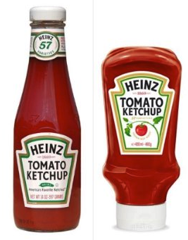
Same product, different UX
ketchup
Discuss - Why do you think Heinz made this change?
A design should be centered around the user accomplishing their tasks. This requires stripping away any secondary or unnecessary features, and highlighting the features that will help.
Invisible
Controls and functions should be intuitive and self-explanatory, and not draw attention to themselves. Remove all distractions and potential hurdles so that the person has a clear path to their goal.
Forgiving
User errors are bound to happen, so design in a way that these errors won’t derail the user’s progress. This typically involves clear and friendly communication, like warnings before critical actions or potential errors.
Consistent
Consistency cultivates security and trust, whereas inconsistency is distracting and forces the user to question aspects unnecessarily. Have a single function work the same throughout the entire site, i.e., if you click the red button on one page, it will perform the same action if you click it on another page. Consistency reduces the cognitive load which lowers the learning curve.
Smooth Onboarding
The onboarding phase, when a user learns how to use the product, greatly affects the opinion they form about it. Use this phase to point out features they may not notice or understand on their own. If there's any doubt about how something works, explain it - However, don’t take too long so they can get to using the product as soon as possible.
A user interface is like a joke. If you have to explain it, it's not that good.
Imagine you are a driver along this road on a Tuesday morning at 9 a.m. Can you park at this spot?
What sounds like a simple question takes a lot of mental processing to answer.
You simply want to know whether they can park at a spot, yes or no, and that’s all the parking sign shows.
This design also makes use of visuals, rather than text, to convey information. The result is incredibly intuitive: green for OK, red for No Parking. It’s even designed for the color blind, with stripes for No Parking.
Now when you look at the sign, you’ll know that on Tuesday at 9 a.m., parking is not allowed.
Mystery Meat Navigation
Mystery Meat Navigation refers to cases where the destination of a link is not visible until the user clicks on it or points the cursor at it. The term “mystery meat” is a reference school cafeteria meals that are so processed that their exact type is no longer discernible.
Below is a screen shot of a real estate website, which is just a grid of thumbnails.
real estate
Are they clickable? If you move your mouse cursor over an image, it changes to a pointer, but what happens when you click on an image?
“Click and find out!” is never a good UX solution.
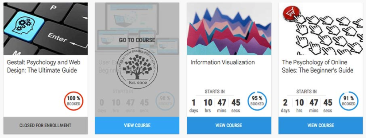
where to click
These cards not only have “View Course” at the bottom of each to indicate the action that will happen, but also have a hover state with the text “Go to course”.
Always label your links! You wouldn’t like to eat mystery meat—and similarly, your users wouldn’t like to click on mystery links.
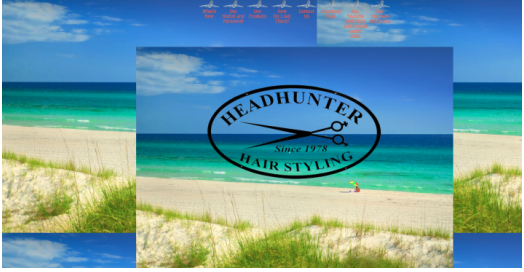
Deceptive Imagery
Are you ready for a tropical vacation ... I mean, a haircut?
tropical haircut
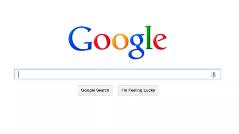
Let's Talk About Google
Google
How is Google's Home Screen:
Goal Focused
Invisible
Forgiving
Consistent
Smooth Onboarding
Even the secondary functionality of the site is intuitive.
Activity (5 Minutes)
What's a site that you use all the time that has good UX?
How is that site:
Goal Focused
Invisible
Forgiving
Consistent
Smooth Onboarding
But I'm not a designer!
Share your projects with your friends, family, and fellow classmates! The best way to find fault in a project is for someone else to try and use it. Try to give them as little outside instruction as possible.
User stories! Write user stories from the perspective of the user: "As a user I want to be able to click on x and have y happen" or “As a , I need a in order to __”.
Exercise
We're going to create the game tic-tac-toe ... but before we begin, what are some user stories that we'll want to make sure we cover?
:elephant: Reminder - Write from the perspective of the user: "As a user I want to be able to click on x and have y happen" or “As a , I need a in order to __”.
Share your user stories in slack as you write them!
 What sounds like a simple question takes a lot of mental processing to answer.
 You simply want to know whether they can park at a spot, yes or no, and that’s all the parking sign shows.